
Humon Hex
Good
- Amazing battery life
- consistent and accurate
- easy charging station
Bad
- Difficult to make sense of the data
- Limited compatibility with devices
- poor integration of data into trainingpeaks, garmin connect, etc.
First there was heart rate, then there was power, and now we have blood oxygen concentration. Increasingly, in our quest for greater and greater sports performance, training is increasingly being driven by data. Data allows us to much more accurately quantify the amount, intensity, and even to a certain extent the quality of the training that we do – all essential in being able to design and execute a training plan to maximise physiological adaptation for athletes. Data is therefore very powerful, but with great power comes great responsibility and it is perhaps an open question as to whether everyone can really benefit from all these new devices popping up, being able to measure more metrics in greater detail.

What heart rate and power metrics tell you about your training and what your body is doing is intuitively relatively obvious, and not difficult for the average person to understand. How fast your heart is beating is an indication of how much effort your body is expending to do whatever it is you’re doing. Power is (literally) your rate of work output, and these metrics tell you a lot of obvious things about your training and performance. Oxygen concentration in the muscle is less obvious. To really understand what it is telling you, you really need to understand how your muscles go through the different energy systems, depending on intensity and duration of exercise.
The basics of it are that when your muscles expend effort, you have three energy systems at your disposal. The first is useful for 10-30 second bursts of high intensity and it is the CP-ATP phosphagen system. Creatine phosphate and adenosine triphosphate which is stored in the muscles is “burned” and you get energy for muscle contractions. A lot of it, but only for a short time because very little CP and ATP is stored in the muscle. The second system is called anaerobic glycolysis (as opposed to aerobic glycolysis; the CP-ATP system is also technically anaerobic) and this one also provides a lot of energy, and even lasts a little longer – intense efforts of 1-3 minutes typically take most of their energy from this system. Finally we have the aerobic energy system which is actually quite complex but basically converts oxygen into energy – this system produces the least amount of energy, but does so for the longest amount of time – essentially forever, as long as you stay hydrated and fueled.
Blood brings oxygen from the lungs to your muscles, your muscles absorb it, and various different chemical reactions use it up. In a nutshell. Being able to directly measure the amount of oxygen saturation in the muscle can give you a very good, and very direct idea of how hard the muscle is working, and what energy system is currently being used (most of the other things that we measure are indirect proxies). What is perhaps slightly tricky about all of this, is the number itself “75” or “62” is meaningless. Your muscle fibre density, capillarisation, distribution of muscle fibre types, etc. all influence what this number would be. What is important isn’t the number itself, but the shape of the graph – how the number moves depending on what you happen to be doing.
Perhaps an example.
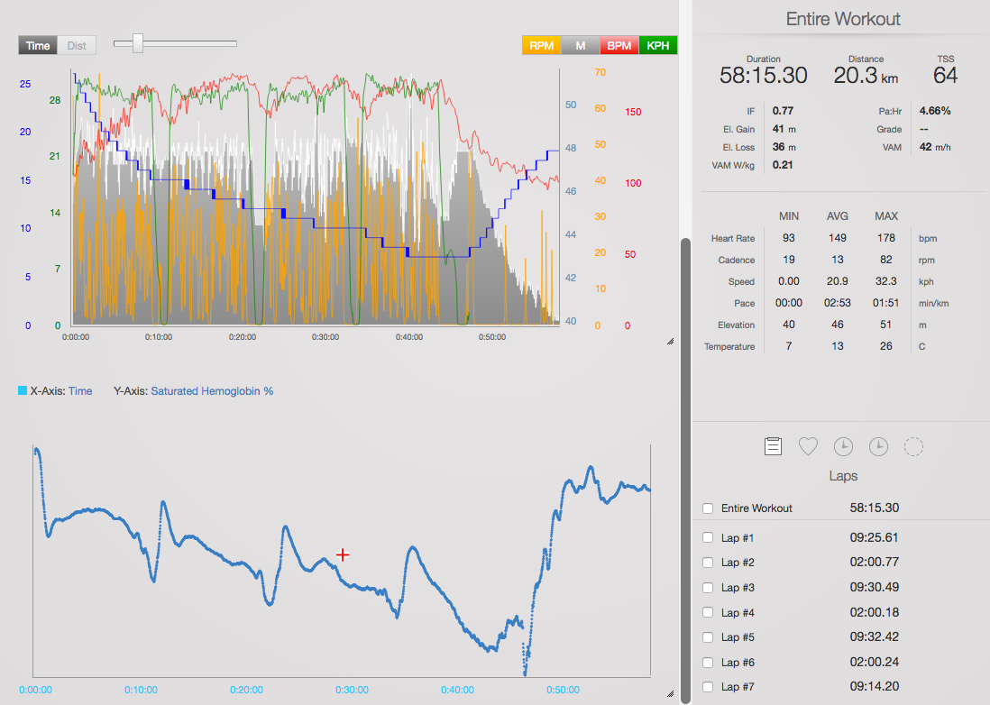
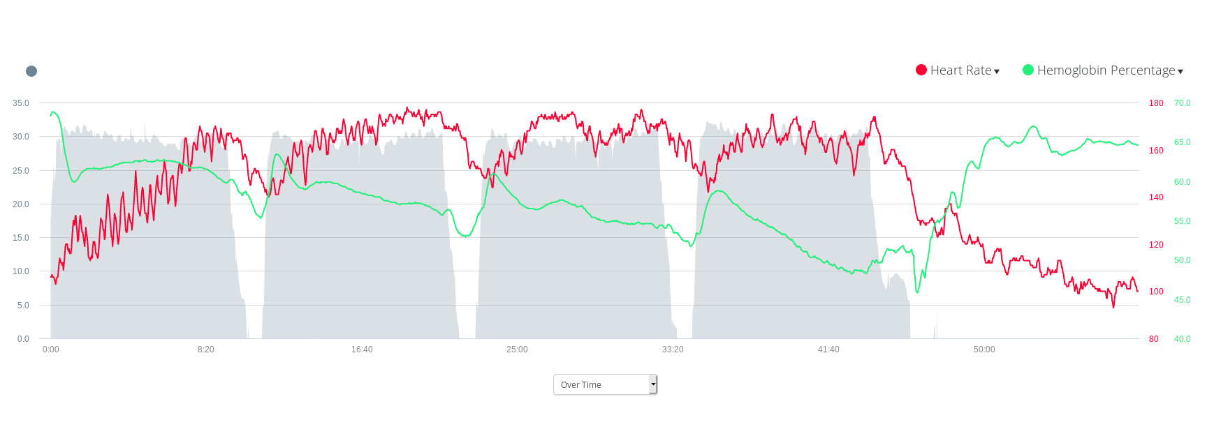
Above are three displays of my training data for a 4x5k (easy) with 2 minute recovery, workout that I did last Saturday. My aim when doing these easy intervals is to skate at an even pace over each of the 4 5ks and also within each 5k. In the TrainingPeaks data (top) heart rate, speed, cadence, and even temperature are plotted against time, but saturated haemoglobin concentration is for some reason stored as a separate field and can’t be put in the same graph. For that, the somewhat awkward interface of Garmin connect’s web app (middle) must be used (to be fair, this is the one thing that app does well). As you can see, when I’m fresh the interval begins with a very sharp drop in smO2, and that’s simply those initial energy systems kicking in, then there’s the leveling off which is my aerobic energy system taking on the load of keeping me up to speed. What, in fact, is happening is even though my aerobic energy system is taking on most of the work, I’m still supplementing my energy output with anaerobic lactic glycolysis which, if I get it right, runs flat by the end of each 5k (and is somewhat replenished during the recovery part of the interval). What you can see from the graph is that even though my heart rate doesn’t indicate that successive intervals are getting harder, the graph of muscle oxygenation does (and this roughly lines up with my rate of perceived exertion). With each successive interval, the sharp drop in smO2 at the beginning becomes less sharp, indicating that I’ve exhausted my CP-ATP muscle stores, and that my aerobic energy system is being activated earlier each time. The last interval didn’t feel very different, but was significantly faster than the others; looking at the graph it’s easy to see why – I was ‘burning’ my legs more (probably because this was an outdoor ice skating workout and by this stage I was starting to feel cold and just wanted the workout to be over.
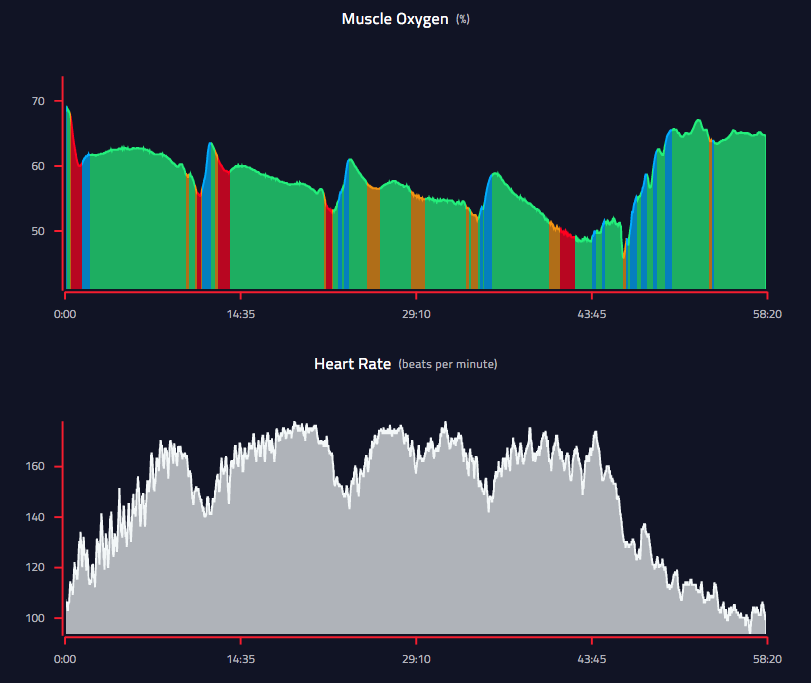
The bottom diagram is taken from Humon’s own web interface showing its interpretation of the various different ‘zones’. The zones are coloured in an intuitive way. Blue is for recovery, green is for steady state, orange is for ‘approaching or at threshold’, and red indicates ‘over threshold’. In this case “threshold” means anaerobic threshold, which is supposed to be the level of output which is theoretically sustainable (some like to call it LMSS or LT2, and if you’re used to taking blood lactate tests, this will typically occur in athletes at around 4mmol/L). Herein lies the value of a device like the Humon – it can tell you where you are, relative to your threshold continually and non-invasively. For any athlete who is serious about training properly, this is an extremely valuable thing to be able to do. The whole point of having power meters, the whole point of being able to ‘feel’ which levels of perceived exertion correspond to what pace, the whole point of having stopwatches in training, is to be able to accurately target specific energy systems. Being able to directly read muscle haemoglobin concentration takes most of the guesswork out of that.
There are, as you can imagine, some caveats to this. Like I said earlier on, the number itself is meaningless. What makes it useful is knowing an athlete’s baseline, and being able to plot the shape of the graph and overlay it with other metrics like speed, power, heart rate, etc. The product is still relatively young in that it currently works with a number of different GPS sports watches, but only on a handful of relatively recent Garmin devices, like my Forerunner 945, is it able to display the colour of the zone. I have no idea how the zone is calculated (it may simply be the slope of the graph), but since the numbers themselves are meaningless and it’s really the rate of change of the number which is useful to us, being able to tell what zone you’re in just by looking at your watch is what is useful here, not the number (the number isn’t even really comparable between sessions within the same athlete, in the same way that heart rate or power is), so being able to see the colour of your zone is almost the only useful thing about this device during your workout.
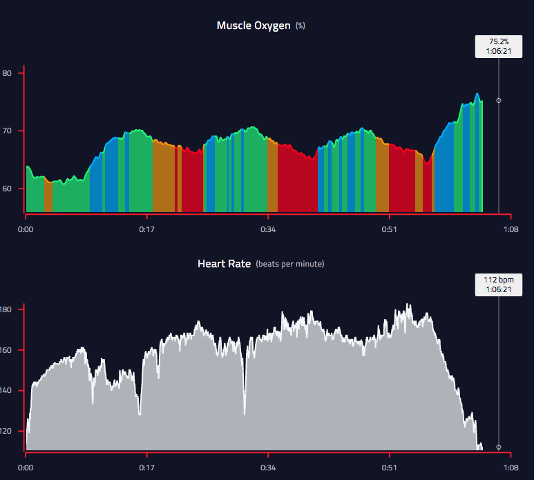
Take a look at the graph above – it is a cycling interval where I alternated spending 8 minutes at 20 watts above my threshold and 8 minutes at 20 watts below my threshold. Ignore the first interval (I just dive into these things without warming up, and by looking at the graph, you can probably see that it isn’t a good idea). What’s nice is that the slope up and the slope down are roughly equal – this is a good indication that the threshold I’m basing these numbers on (which is really just an educated guess, because I’ve never been properly tested) is probably about right – if my estimated threshold was too high the down-slopes would be steeper, and the up-slopes would not be as steep, and that would result in me slowly dropping in smO2 in a similar fashion to the 5k intervals in the first example (where the recovery was deliberately very short to elicit this effect). So at the end of the day, being able to measure smO2 was extremely useful for this workout, but during the workout itself gathering this information wasn’t really helping me.
There are, of course, situations where the information might be useful. There are these bike intervals that I occasionally do where I ride 1000m at 100% effort in a big gear from a near standing start, wait until I’m “fully recovered” (typically 5-8 minutes is prescribed, if only for practical purposes) then go again. In these kinds of intervals, waiting for the zone colour to turn blue, then green again before going for another interval will probably give you a better indication of being ‘recovered’ than using your heart rate (especially in shorter intervals, where heart rate ‘lag’ can represent a significant portion of the interval or its recovery portion). These types of interval are not common though. It is possible that having access to this kind of information may slowly change the way certain workouts are prescribed, but for now it seems like a technology that needs to mature a little bit, in particular in the way it presents information. To be clear, it presents the information very well, but what I’m getting at is what information is presented – some interpretation of the data is needed in order to make it more (immediately) actionable. Perhaps over time, and with more and more data being collected, it will become more obvious which direction this needs to go.
At the end of the day, this is an interesting product. I can recommend it for coaches, and athletes who are a little bit on the nerdy side of things. These kinds of sensors have actually been around for a while the BSX insight came and went, and the Moxy muscle oxygen monitor is still around. The Humon however represents a significant leap in the usability of the technology and coupled with that, a much lower price (I’ve been considering getting a Moxy for a while, but they’re very expensive and while ‘wearable’ aren’t really practical outside of highly-controlled test settings. The information provided still integrates awkwardly into many of the existing analysis programs out there, and still finds the majority of its value in post-workout analysis. If you know what you’re looking at, it can be very useful for making the kinds of adjustments to training programs which you should be making depending on how well you’re training and recovering. Paired with a tool like the Whoop, tools like this and the way they can be used, become more valuable.
With the lower price and convenient form factor, this kind of information is democratised and made available beyond the confines of elite sports labs and that should slowly make things better. Not so long ago, very few people had power meters, and when I first got mine back in 2011, it wasn’t totally clear what I should do with it, or how it would add value to my training. Now, training with power for cyclists is a fairly normal thing and modern stationary bike trainers almost need to have it in order to access a world of virtual training environments like Zwift. I believe muscle oxygen is at a similar stage to where I was with my power meter almost 10 years ago, although I anticipate that it will develop more slowly, simply because the nature of the data and what it represents is more complex (although I could be wrong). This will certainly be an interesting space to watch, but in its current state, it’s hard to recommend this for most athletes as it won’t necessarily add much value to your training. If you’re really into analysing your training data, or have a coach who does it for you to make adjustments to your program, then it makes a little bit more sense. For a coach, this is a great tool, and if I was coaching a commercial team and had a budget, this is certainly a tool that I would have on my wishlist to monitor everyone’s training and be able to peek under the hood in between more formal tests in the lab. As an added bonus, the battery life of the device is amazing and the wireless charger which is included is extremely easy to use and plugs into a regular mini-USB cable.
Leave a comment