Old Site
In Case You Missed It…
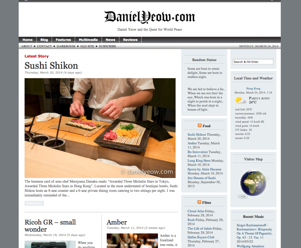
The continuing evolution of danielyeow.com has necessitated further renovations. After about five years of dedicated service, the “Magazine Basic” theme has finally been retired. It was a great theme, and I would recommend it to anyone. Its simplicity is really what made it so robust, and kept it service for so long, despite the occasional flirt with other themes (including its bigger brother, Magazine Premium” whose complexity was its own worst enemy).
Simple as can be, but no simpler – widget areas in the sidebars, and in the main content area the content. On the front page, a simple list of recent content with thumbnails, arranged in a grid to give visual precedence to the most recent stories. The real reason I had to move on though, was that I now generate content at a higher rate than I did previously, and old articles get ‘lost’ very quickly. The sidebars with RSS feeds of my favourite categories addressed this a little, but ultimately I needed a theme with a front page which could simultaneously display recent stories, giving visual precedence to the most recent (now in the form of a nifty slider), while also showing stories from many other categories, which the current theme does nicely.
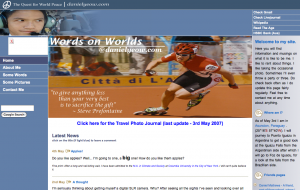
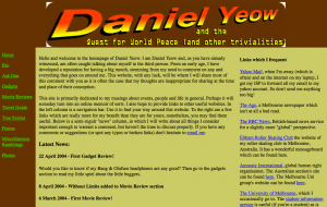
The old-old danielyeow.com has not completely disappeared. The original front page can still be found here:
If you have old links to the old part of the site, simply insert “oldsite/” in the URL. For example http://www.danielyeow.com/latintravel07.html would become http://www.danielyeow.com/oldsite/latintravel07.html (or you could just click the picture below).
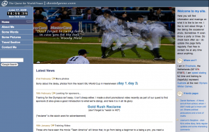
It seems funny that what started as a joke (the joke was to simulate the look of former Prime Minister John Howard’s website) ended up being the look for my website for two years.
It was the first look to use cascading style shees (CSS). Funnily enough, nobody really got the joke, but that was probably because John Howard’s website was probably visited about as often as mine was, and the two groups of visitors were mutually-exclusive. After a while, I decided that John Howard’s site wasn’t particularly well laid-out or well-designed, so I modified it slightly and that was the look that I stuck with until June 2009.
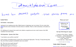
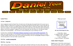
Prior to this, danielyeow.com took on a very minimalist-graffiti look with artwork penned by myself on my wacom-tablet-PC.
Immediately preceding this was the infamous “vomit” look consisting of earthy greens, yellows, and browns which was also the last look to use frames. It went through two incarnations before the colour scheme finally annoyed me enough to change it.
That was the first website to exist under the domain name “danielyeow.com”. Prior to this, my “website” existed as the simplest string of html tags, taking on the classic centered-text, psychadelic-coloured-text-on-black-background single-page with the occasional tacky animated gif. It jumped from geocities to yahoo-geocities, and then through various ISP hosting which provided a then-generous 5mb of storage… how times have changed.
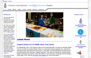
The newest incarnation represents the current state of personal websites, going far beyond simple HTML and CSS. PHP and MySQL are the latest acronyms in language of content management, allowing consistent and easily navigable pages allowing the content author (me) to only have to worry about the content and not the presentation. This allows for extremely complex (in terms of code) websites to exist which look, on the surface, to be very simple. Anyway, I hesitate to think about how much more complex websites will be in the future. This is also my first foray into a fixed-width design, a trick I learned when I designed and built the website for the Columbia University Amnesty International group.
Although this was done in plain HTML and used only one CSS file, I was able to experiment with layout and user-friendly-ness while trying to keep the code as simple as possible (so that my successor could easily pick up where I left off, something which didn’t really happen but… oh well).
